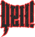
You might have noticed that we have had an extensive redesign. Gone is our old skull logo, replaced by some kick-ass lettering. And you might notice that everything is bigger, because bigger is better damn it! Bigger pics, bigger video boxes, bigger text, bigger attitude, bigger feet… Some of the new stuff you might find, in addition to the content that you already know and love, are daily quotes, daily bad-ass pictures, and a calendar of events to check out. Click on ’em to find out what these things are all about.
We’re still wrestling with a few issues (such as the new calendar), but for the most part things are running like they were lubed with KY Jelly. The reason for our redesign? We felt things had grown a bit outdated and stale, and we wanted to present you with our best side… basically, we want to give you something bad-ass awesome to look at and read. Fact is, if you want to keep up in today’s world, you gotta keep a fresh face.
Since we did all of this for you, feel free to drop a comment down below if you encounter something that doesn’t work functionally or if you have a suggestion to make something better. And don’t forget to thank our very own King Hazard for the beautiful design!
Rock Hard \m/


Stay Connected